
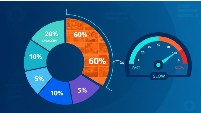
Images are often the heaviest assets on a webpage. Unoptimized photos can account for over half of a page's total weight, dragging down load times and hurting both user experience and search rankings.
The good news? A few straightforward techniques can cut image sizes by 50-80% with no visible quality loss.
Why Image Size Matters
Every additional kilobyte a visitor has to download delays the moment they can interact with your content. Google's Core Web Vitals, particularly Largest Contentful Paint (LCP), penalise slow-loading hero images directly in search rankings.
For content-heavy sites like blogs, portfolios, and e-commerce stores, compressing images is often the single change that shaves the most seconds off page load. A typical uncompressed blog hero image weighs 2-5 MB; after WebP conversion at 80% quality, that same image drops to 200-400 KB.
Modern Formats: WebP and AVIF
JPEG and PNG served us well for decades, but newer formats deliver the same visual quality at a fraction of the file size:
| Format | Compression | Browser Support | Best For |
|---|---|---|---|
| JPEG | Lossy | Universal | Photos (legacy) |
| PNG | Lossless | Universal | Transparency, screenshots |
| WebP | Both | 97%+ | General purpose replacement |
| AVIF | Both | 92%+ | Maximum compression |
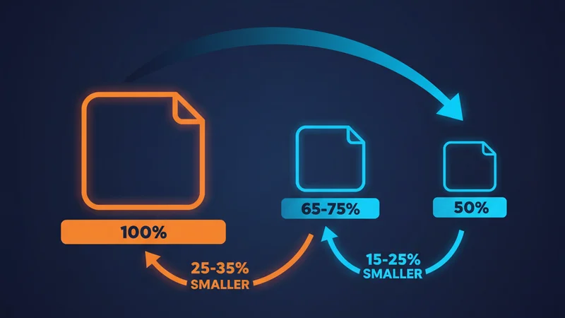
WebP typically produces files 25-35% smaller than equivalent JPEGs. AVIF pushes that further, often 50% smaller, though encoding is slower.
Choosing the Right Quality Level
There's a sweet spot between file size and perceptible quality. For most web images:
- Hero images and product photos: 80-85% quality
- Blog post images: 75-80% quality
- Thumbnails and previews: 60-70% quality
Below 60%, compression artefacts become noticeable. Above 85%, the file size savings diminish rapidly.
Responsive Images
Serving a 2400px-wide image to a mobile phone on a 3G connection wastes bandwidth. Use responsive images to deliver appropriately sized files:
<img
  srcset="photo-400.webp 400w, photo-800.webp 800w, photo-1200.webp 1200w"
  sizes="(max-width: 600px) 400px, (max-width: 1000px) 800px, 1200px"
  src="photo-800.webp"
  alt="Descriptive alt text"
/>
This lets the browser pick the smallest image that fits the viewport.
Lazy Loading
Images below the fold don't need to load immediately. Native lazy loading is now supported in all modern browsers:
<img src="photo.webp" alt="Description" loading="lazy" />
For Next.js projects, the Image component handles this automatically.
Automating Your Workflow
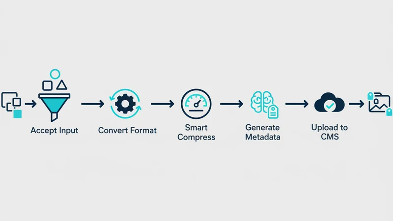
Manually compressing images one by one doesn't scale. A good workflow should:
- Accept any input format. Drag in JPEGs, PNGs, or even RAW files
- Convert to modern formats. Output WebP or AVIF automatically
- Apply smart compression. Reduce file size without manual quality tuning
- Generate metadata. Create alt text, titles, and descriptions for SEO
- Upload directly. Push optimized images to your CMS or CDN
This is exactly the workflow SquishMate was built to streamline. Drop your images in, adjust quality if needed, and get compressed files with AI-generated metadata, ready to upload to WordPress or download as a batch.
Quick Checklist
- Use WebP or AVIF instead of JPEG/PNG where possible
- Set quality to 75-85% for most web images
- Serve responsive images with
srcset - Lazy-load images below the fold
- Compress before uploading, not after
- Always include descriptive alt text
Where to Start
Pick your 5 highest-traffic pages. Convert their hero images to WebP at 80% quality, add loading="lazy" to everything below the fold, and measure LCP before and after. That single pass will tell you how much your site has to gain, and it usually takes less than 30 minutes.